Table of Contents
Have you ever landed on a 404 page, while browsing online? At least once, you would’ve stumbled into a 404 page.
Lost in midst of nothing!
Think back then, when you clicked on the link and you landed on the page where you found nothing. You must be really annoyed at that time! Because you couldn’t find what you expected and was lost. And without thought, you backed up immediately.
You may ask why does a web page like that even exist?
Let me put it simply, what “404 ERROR page not found” really means to the visitor of the webpage. Actually, it is a sign of an apology from the creator who has broken links on his website. This plain lousy page makes the visitor leave the website and never return (Gone forever).
As we know, “Smart work beats Hard work”. If you can relate, they apologize in the coolest way!
You would’ve have come across some fascinating 404 pages that left you entertained and giggle a bit unconsciously. If not, no worries you are here to do the giggling and get to know some of the interesting things behind the 404 page.
What’s Cool in a 404 page?
Errors can happen anywhere and anytime on your website. The links can break or the content is deleted/changed over time. For the fact, the average lifespan of a webpage is a hundred days. So be ready! the 404 error page is possible for all. 
The visitors can get frustrated when they are lost in 404 pages, they need your help to return back. You have the responsibility to redirect them. That is where this page becomes a very sensitive paddle, there is a risk of losing a valuable reader to your webpage. Some of the creative minds take a step forward, to blow the visitor’s mind and make them their regular visitors.
We got your mind voice covered! Not be complex. But, there is a lot of efforts and time to put in. To bring out the best out of nothing. The clever creators are prepared to greet the visitors well and lead them to the right when they are lost, without much fuss. Clever creators make you say, “That was a smooth”. This user experience will automatically increase page ranking and traffic. If you are a salesman make it a potential space for selling the products or make a new visitor into a fan follower.
Do you know, how they do it? There must be some great ingredients, right? To make the visitors stay, feed them the good stuff. To provide your visitors with strong and remarkable user experience. Mix these below ingredients well during the web design. Because it’s time to spark a connection with the visitor in an unfortunate situation.
- Add Illustrations/Creatives
- Make it Entertaining/Informative
- Play with Typography
- Give it a Motion
- Why not Emotion
- Fully Interactive
- Let it be Simple & Literal
- Drop a Pun or a Joke
- Do it Different.
In this post, we are gonna take a peek at the 20 most brilliant 404 pages that turn the visitors into loyal customers within a few blinks.
1. 20th Century Fox
20th Century Fox has a good drift to inspire you when you can’t find a movie. The 404 page is simple, yet smart. The phrase is ironical and moving still is pitchy. It’s a scene from the movie, Edward Scissorhands (1990). This is what we spotted on the page, but there are other snippets like the Napolean Dynamite, Revenge of the nerds and more.
2. Fork

This one looks creative! Fork CMS has an aquatic design and copy that is suitable for the theme. With the brilliant fusion of illustrations and text, it never fails to catch the visitors’ eye.
3. Pixar

Sometimes, we may take things to our hearts! The 404-page features sadness from its popular movie “Inside out”. The animation movie brand has the finest design and enough of comforting white space on the page.
4. Bitly

Bitly is a webpage for URL shortening services. The 404 page features an abandoned pufferfish in a waving sea and seagull in the sky. The pufferfish is floating upside down and respond to cursor movements. The seagull gives a calming look. Animated to fly and appears to have variations in the clouds.
5. Waaark

You will be amazed by this french studio waaark’s 404-page. The page design looks good enough, but, it will beat your expectations when you listen to the audio. Inspired by Stephen Hawking’s book The Hitchhiker’s Guide to the Galaxy. Get your headphones before you get there. (Now, click the title “ Waaark”)
6. Lego
The page is attractive without overcomplicating the context. They just let the characters do the talking for them. Lego has some effective branding techniques. Every time you see the page, you’ll smile.
7. Brand Crowd

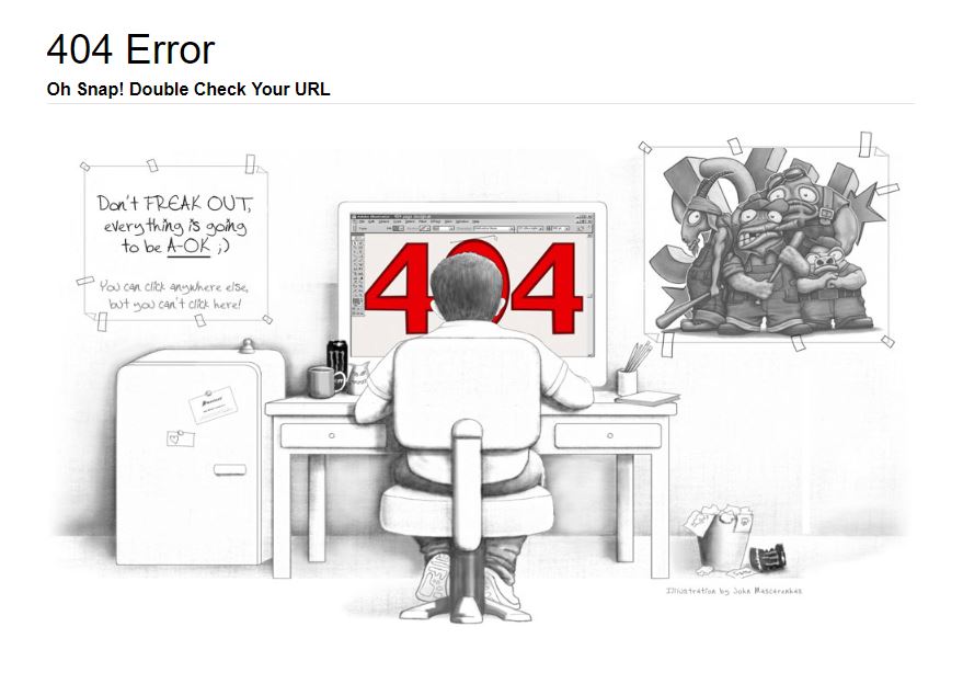
Brand Crowd has a cool and comical illustration with a clever copy. “You can click anywhere else, but you can’t click here”. they make wit. This is ain’t a boring page to land on.
8. IMDB

Take a look at another movie based 404 page A comprehensive database for movies features iconic quotes from different movies. If you hit the refresh you’ll get a new quote. And the link below provides more information about the movie. Isn’t interesting? we loved it!
9. Airbnb

Airbnb features a girl dropping her ice cream to the ground. You can’t help, but feel bad for the Airbnb animated girl. Airbnb’s 404 page builds a friendly and personal bonding with the visitors and cultivates branding image.
10. Tripomatic

This is one of the most creative illustrates we have come across. They have a fusion of cartoons and funny memes using what people love. To amaze the visitors, who reach the page. This 404 page makes it worth getting lost on the internet.
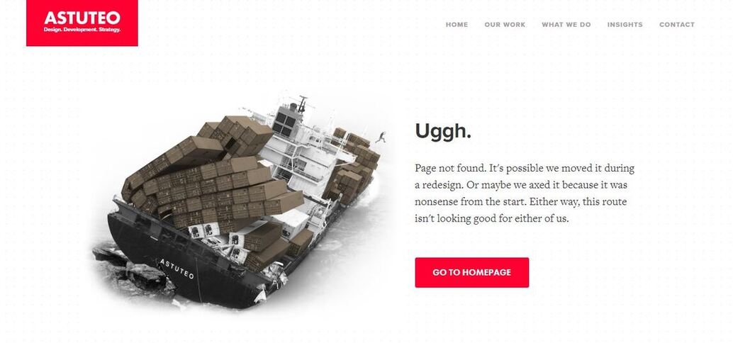
11. Astuteo

A digital marketing firm will delight you with an interactive copy with visitors. The message is smart and resonates with the people who reach the page.
12. GitHub

This is tricky and impressive! You can see a star war parody, with the parallax effect. Github seems to target a different kind of techie. There is an enormous search box, guiding the visitor to get them where they want to go.
13. Marvel
Genius, isn’t? Marvel uses its hero on the 404 pages with a small message. The error page contains subtle animations and a new character when you hit on refresh. Don’t miss a clip. Take a look now!
14. Mail Chimp

Mail Chimp is an email newsletter service. In 2018, it underwent a rebrand. To make the 404-page suit their design. Look what they did!
Why donkey’s head in the hole? Is the donkey looking at nothing! You should believe that, this off-beat donkey got them trending!
15. Heyzap

If you love playing games, you might never leave this 404 page. Heyzap has a highly interactive gaming experience for you when you reach their 404 page. They present perfect elements to increase the time spent on the page and reduce bounce rates.
16. Aerolab

So little content! Yet an impactful in a contrasting design. With the satisfying line art, Aerolab’s 404 page joins as one of the brilliant 404 pages in the chart.
17. Bret Victor

Bret Victor, a computer scientist, gives rise to the philosophical statement on his 404 page. Inspired by the famous painting of Rene Magritte. With the phrase “ This is not a page”. The viewer has to console this philosophical challenge of what it is referring to! But it means the page doesn’t exist and you should agree with a no.
18. Blizzard Entertainment

Here is another simple, but also a very cool 404 page. The creator picks fun out of the blues. To match the theme website, aminatedd character in movement with the literal phrase that can grab visitor’s attention.
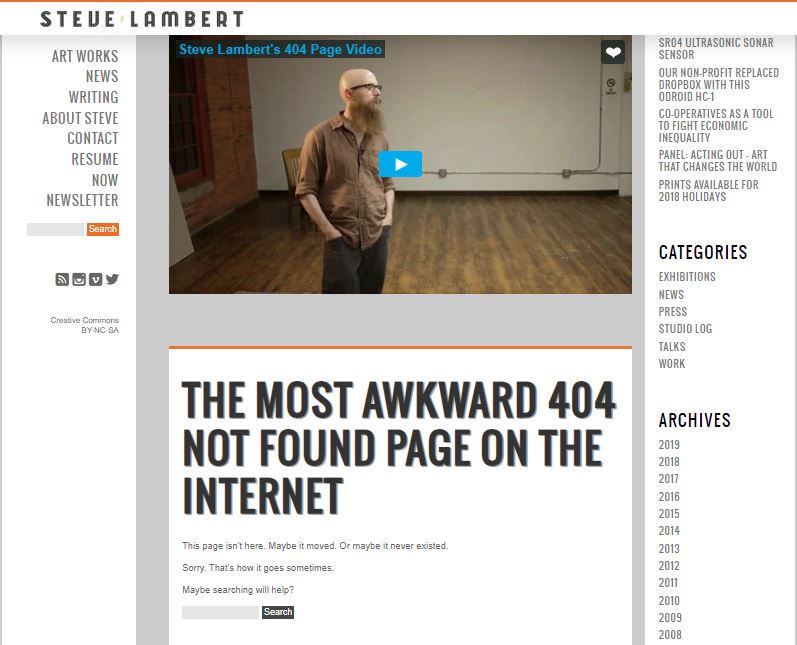
19. Steve Lambert
“The most awkward 404 not found page on the internet”. An artist, Steve Lambert, New Yorker, has described it well. He features a video on the page, that is continuously playing. Can you get to the end of the video without clenching?
20. Hubspot

Hubspot will get along your emotions. They have a convincing design. Telling the visitors a message that they have an issue on the website. At the same time, it makes a clear point to maintain the voice of the brand.
Adios!
Feeling inspired by the designs! Which of one is your favorite? Which one is brilliant?
These creative minds are never going offbeat with the above fun loading elements. So, what are you planning to do for your 404 webpages?
You shouldn’t make the user feel bad for visiting your page. Instead, ensure that they are happy to land there. Innovative and cool ideas can make your work easy. That will increase your visitors into loyal customers.
Had some fun? Now, share the joy with your friends!
[contact-form-7 404 "Not Found"]


