Table of Contents
When it comes to E-commerce, the majority of the crowd focuses on the SEO or the SERP ranking of their sites. And only a few put more effort on the user experience. Certainly, if SEO helps in bringing in new visitors, a compelling UI and UX converts them effectively from a visitor to a buyer (who comes back again). In addition to this, an excellent UX can help in search engine ranking as Google prioritizes websites with better navigation.
Here are the UX best practices that are essential for every eCommerce sites.
Home Page
The home page is the user’s first encounter with your website and leads the user to possible ways to navigate through your website. Hero page is the page that can be the home page or the landing page. And the hero area is the prominently visible area to your user at the first incident.
The user has arrived at your home page and you only got 50 seconds maximum to make your first impression. What should you do?
Keep It Simple
A human with too many options tends to take a lot more time to make a decision.
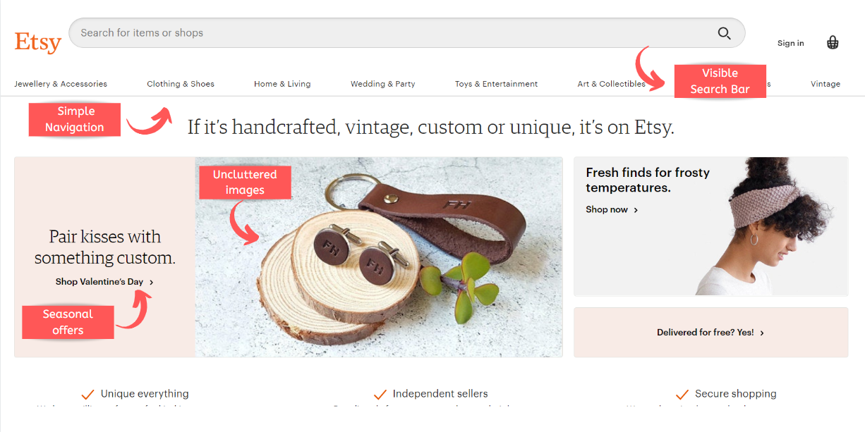
To put it in a nutshell, the best practice for the home page or the hero page is to keep it minimalistic, neat with less content, uncluttered images and less complicated options. Do not give your users too many options to get carried away with other distracting choices. Lead the way directly to your call to action.
Personalize
A study conducted by Evergage proves that 56% strong impact is created by a personalized home page. And 46% of organizations are trying to personalize their homepage. One of the commonly seen examples of amazon’s recommended product list is more than enough to represent the importance of home page personalization.
Best UX practices for Home page
- Latest deals and offers
- Uncluttered images representing exactly what you sell.
- Simple design.
 And strict NOs to
- Blog promotion
- Outdated content
- Automatic sliders
Categories and Product Listings
Be straight forward. Let it be categories or site navigation.
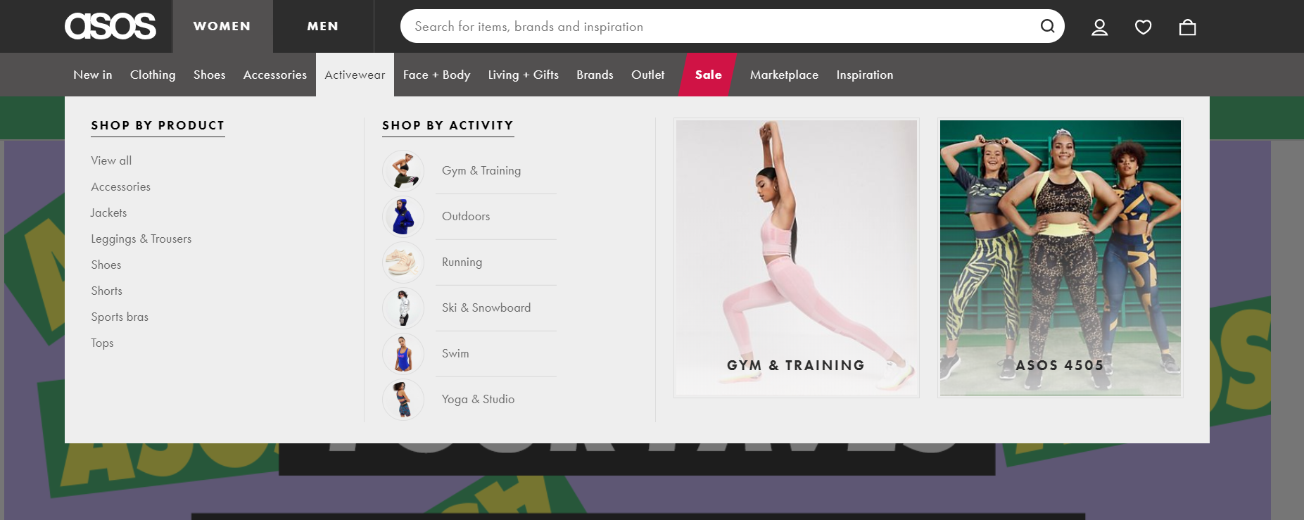
Effortless navigation to your simply defined categories is the key to excellent user experience. Categorize the products according to the mental model of the customer. Make categories easily accessible from the home page. If you have too many categories, categorize it into a few main categories and add others to subcategories.
What should I do if a product comes under two or three categories?
Whenever you are stuck with a question like this, ask yourself this question. can your customer can easily reach the product he is looking for? Do whatever that is required. That is the best user experience. Here you will need to put the product in every category it belongs to. So that the user can easily find the product under any category.
Best Practices for Categories
- Name the categories in customer-oriented names. (not business names or biological names!)
- Limited categories (main and subcategories)
- Test your categories (tree testing or card sorting)
- Use images to define categories.
When it comes to the product listing, it is mandatory to have filters.
Easily Accessible Filters
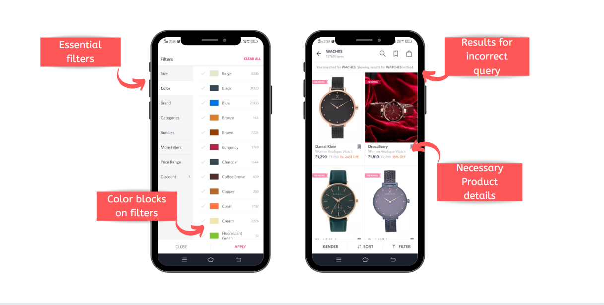
Filters are the crucial features for the customer to search the product that a customer is searching through the thousands and thousands of products. Despite the type of the product, the following are the essential filters: price range, size and colour. You can provide text inputs, sliders for the price range, predefined ranges or selection fields to make this effortless.
Dynamic or User Command Sorting
This means that the filtering happens as soon as the user chooses the filters. The products get dynamically sorts while the user is choosing the filtering options. You can also opt for user-command sorting that filters only when the user confirms it with a save button. Depending on your product and technology, you need to choose the one that works for you.

Infinite Scrolling
You can go with pagination, or load more button too. But infinite scrolling is the one that gives a seamless user experience from my experience. It gives an endless flow of brilliant products that your customers might love to see (buy).
Best practices for Product Listing
- Product listing with essential filters and sorting options
- Product list showing the necessary product details (Price and size available)
- Add related icon to your filter. For instance. Show colour blocks in the colour filters.
- Show number of pages below the product listing if not infinite scrolling.
- Use good quality product images to let the users zoom in and out through the product details.
 Search Bar
A customer-centric search is everything that a customer requires. The visitors who use a search button is the one who knows what he/she wants and might know or not exactly the name of it. So, this customer is important to you as he enters a little deep inside your funnel.
Intelligent Dynamic Search Dropdown
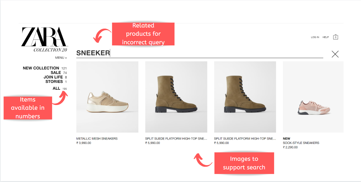
More than 40% of the visitors use search auto dropdown to find the product they search for. Sometimes as already said, the user might not know the exact spelling or the exact name of that particular product. In that case, the search should show related products with that keyword instead of throwing a no results page.
- Show related searches (instead of no results)
- Dynamic search dropdown
- Support queries with typos or spelling mistakes
Note: Some products are named in more than one or in short forms. Ensure that your search involves all the possible names of a product. Also, check if your product description is well defined.
Well-positioned Search Bar
Apart from the intelligence of the search bar, it got to be well-positioned at the right place with a magnifying glass icon in its corner. Remember, when your visitor is searching for a search bar on your site, he will fall deeper into your conversion funnel. So, make sure that you have a working one with an auto-complete option in it.
Simplify Search with Filters
Adding a filter option to the search process makes your customer’s search more specific and personalized. This also simplifies their search process. Experts suggest that if the search results show up more than 20 products, a filter is a must-to feature. And, price, size and colour are the basic filters needed.
Voice Search and Image Recognition
Any successful design is built to cater to the requirements of upcoming trends. So, your design should be able to accept inputs in the form of voice or image to let the users find what they want from your site. It is as simple as that.
At the end of the story make sure that your customer gets what she/he wants from the search.
Product Page
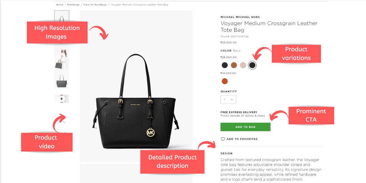
It is where all of your efforts from UX, SEO and marketing meet togeather. This page should be precisely balanced with SEO(semantic SEO), content in the form of the product title, image, descriptions and specifications and a compelling Call To Action.
High-Resolution Images and Videos
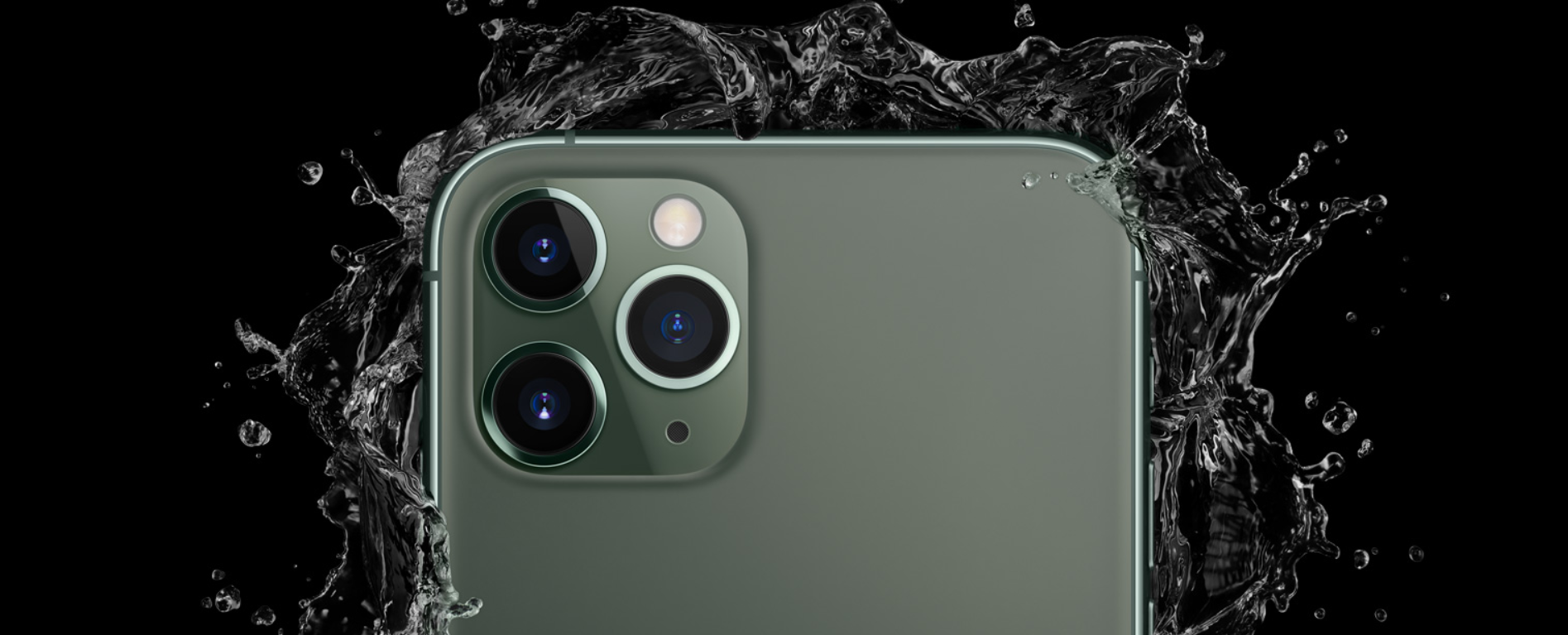
Did you know 40% of users reject a product with low-quality images? Show the product images with high resolution to let the user scan through the product. In this era, your product only sells if that’s worth Instagram pictures. So, take excellent product pictures. If your technology permits, go for irresistible product videos to compel the user to click the call to action button. From my experience, Zoom-in when hovering over the image is one of the best choices to enhance UX.
Mobile Optimization
Mobile eCommerce is a completely other technology that focuses extremely on the mobile user experience of an application. Don’t let the user zoom in to choose an option from your site. Almost 51% of Americans purchase online through mobile. So, it is crucial for every eCommerce site to optimize their site for mobile users.
Detailed Product Description
The product description helps in converting the user as well as to enhance SERP ranking. Make sure that you provide a short product summary, the additional options available, product reviews, images of the products that customer received and others.
Prominent CTA
A visually compelling Call To Action is very essential as the customer has reached the end of the funnel and at the purchasing point. Let the user take that specific action with a button made with vivid colours. Try usability testing with your site to get the best out it.
Note: User-generated content plays a crucial role in building trust. Some of the best user-generated content are customer photos, reviews and ratings.
Checkout page
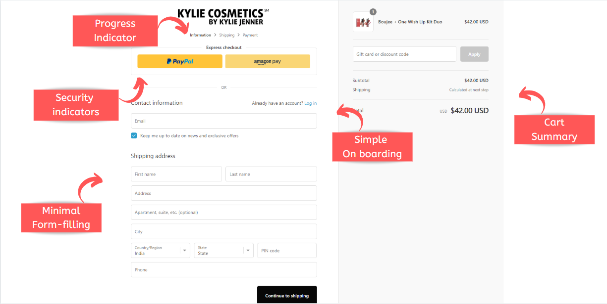
Did you know how many of the customers turn back if the checkout page is long or complicated? It’s about 17% of the customers consider frustrating checkout process as their one of the top mobile shopping problems. If you want to make them signup to make the order, ensure the onboarding process is simple or you are going to lose a customer.
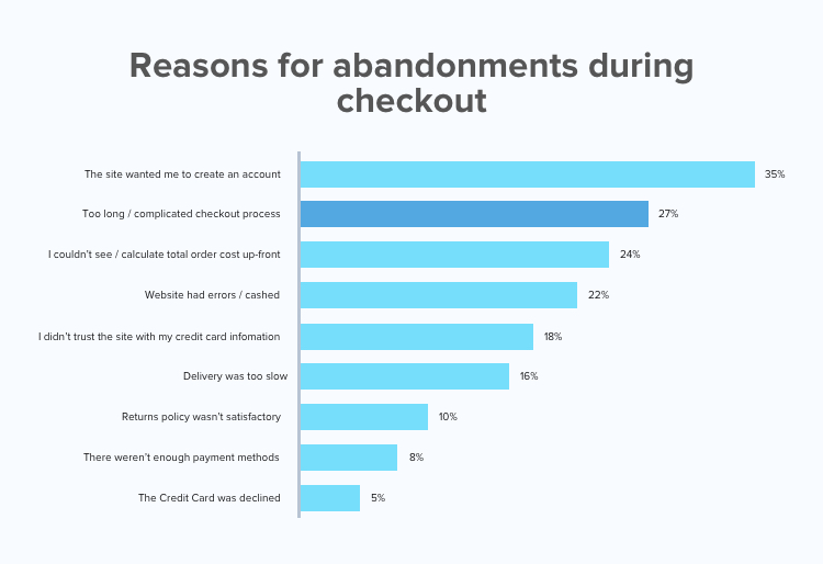
Note: Keep it simple, an email ID and a password is enough for signup. Or allow the user to login through their already existing third-party accounts like Gmail or Facebook. You can get the other details later.
Progress Indicators
The progress indicators let the user know where he stands in the purchasing process. This representation will also streamline the shopping process for the user. So, users move faster to the next step and encouraging words like “one more step to go” and others let the users in positive emotion.
Security Indicators
Users might abandon an eCommerce site if they don’t trust the website. It usually happens when the site asks for their credit card information. You can earn trust by adding an icon of a lock near the card information or by informing the user your website is secured by cybersecurity badges.
Minimal Form Fields
Make your forms short. Ask only the essential information needed for shipping: name, address and mobile number. Most of the users abandon their cart for this reason. Don’t let the user feel annoyed at your long form-fillings. If possible categorize the fields like 3 fields under shipping address and 3 fields under user information and likewise.
Summary
Best UX practice for any Ecommerce site is responsive web design with an uncluttered and focused design neatly organized to enhance effortless navigation. So, to practice all of the above, you will need strong technology to support and talented web developers to execute these features. Don’t hesitate to contact the best web development company in the industry.


